History of the project
Health Icons started in May 2021 and has since expanded into an international all-volunteer effort to provide health icons for projects around the world.
Origin story with DHIS2
In the spring of 2021, Daniel Burka was doing a project with the DHIS2 software system as part of a large-scale hypertension control project in Nigeria. DHIS2 is a popular open source digital health tool that is used governments in over 70 countries all over the world. DHIS2 has many admirable qualities, but the quality of the icons in their software back in 2021 were very inconsistent. See below.
DHIS2 had around 400 icons that represented common themes in public health, education, and climate change. Many were pretty commonsense icons that you might expect from health, like hospital, clinic, blood pressure monitor, etc. But some icons were very specific concepts like Rapid Diagnostic Testing Result Invalid that were related to specific usages of DHIS2 for managing pandemic response programs. Other examples include Cone Test on Nets and Discriminating Concentration Bioassays. If you're ever wondering why the collection includes some very specfic icon, the answer is probably because it was in the original DHIS2 collection.
The original DHIS2 collection was scaled at 48px size because they were often used as descriptive symbols in the DHIS2 software and needed quite a bit of detail. So, accordingly, our first 2 years of Health Icons followed this standard. We would later create 24px icons that are a better match with popular icon sets like Google's Material icons, Remix icons, Feather icons, etc.
Many of the original icons that were created for DHIS2 feature the tag "DHIS2" and can be found by searching Health Icons by "DHIS2".
Health Icons were first incorporated into DHIS2 in version 2.37 in June 2021.
A volunteer effort starting in 2021
Daniel put out a call on Twitter to see if other people wanted to help out with the effort to replace the DHIS2 icons. About a dozen designers jumped in and we started redesigning DHIS2 icons in Figma. At first we didn't have a well-defined style guide for new icons and were just making up styles as we went. After a few weeks, we stopped and looked at what made a good "Health Icon." We established a few standards, like:
- 2 pixel stroke width
- Intentional mixing of round endcaps for strokes and sharp endcaps
- Cutouts in shapes to create uniqueness (e.g. Microscope)
After completing the DHIS2 icon set redesign, we expanded our work to include many other common health icons. At first, we created lists of common medical terms, devices, conditions, etc. Later we added the ability to request icons from the public (see below).
Since we started in 2021, many contributors have come in and out of the project. Some people contributed 1 or 2 icons and several prolific contributors created dozens of icons each. Dr Greg Schmidt, an internal medicine doctor from Canada with global public health experience, has acted as our medical advisor for feedback as we create icons. We list most of the people who contributed to the Health Icons project on the About page of our website.
Choosing which icons to create
The first icons mirrored the icons available in the DHIS2 software library. Then we expanded to commonsense health icons to round out the collection. We then put a Request an icon link on our website and have had dozens of requests from medical professionals and software developers from all over the world. You can see a full list of completed and still-to-be-done icons on the Github issues page for the project.
We honestly are not too picky about choosing icons and any health-related icon that seems reasonable by our volunteer team is added to the collection.
Icons vs. symbols
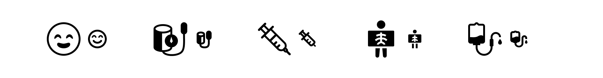
The original icon set was designed at a 48 pixel grid. In hindsight, this made the Health Icons set really more 'symbols' than 'icons.' They were really useful when you needed a symbol to be recognizable on a large button, in a PowerPoint presentation, or on a sign. But, the 48 pixel icons were not ideal for using in user interfaces, especially alongside common icon sets like Google Material icons, Feather icons, Remix icons, etc.
In 2024, we started redrawing many of the icons at a 24 pixel grid (half the size), which meant reducing the amount of detail in each icon. Today, many of the icons have been redrawn in this smaller size, which makes them much more useful in software user interfaces and apps.
CC0 public domain
From the very beginning, we wanted the Health Icons to be used as widely as possible. So, we chose to label all icons with a CC0 (Creative Commons Zero) license, which is a type of public domain license. This means that anyone can use the icons, they can modify the icons in any way, they can sell the icons, they can sell products containing the icons, and we retain no ownership. We even let almost anyone into our Figma so they can access the originals of the icons.
The website
Description coming...
Other volunteer projects
Figma plugin
React packages
No tracking usage?
Description coming...
Health icons in the wild
Description coming...